Typography
/
Editoral
/
book design
(
2
)

/ About the project
A type specimen book for Futura, the geometric sans-serif designed by Paul Renner in 1927. The project traces the typeface's history, design philosophy, and cultural legacy; from its Bauhaus-era roots to its enduring presence in film, art, and brand identity.
Showcased at Type Hub 2026, Ada Sleight Gallery
at OCADU
/ Year
2025

/ challenge
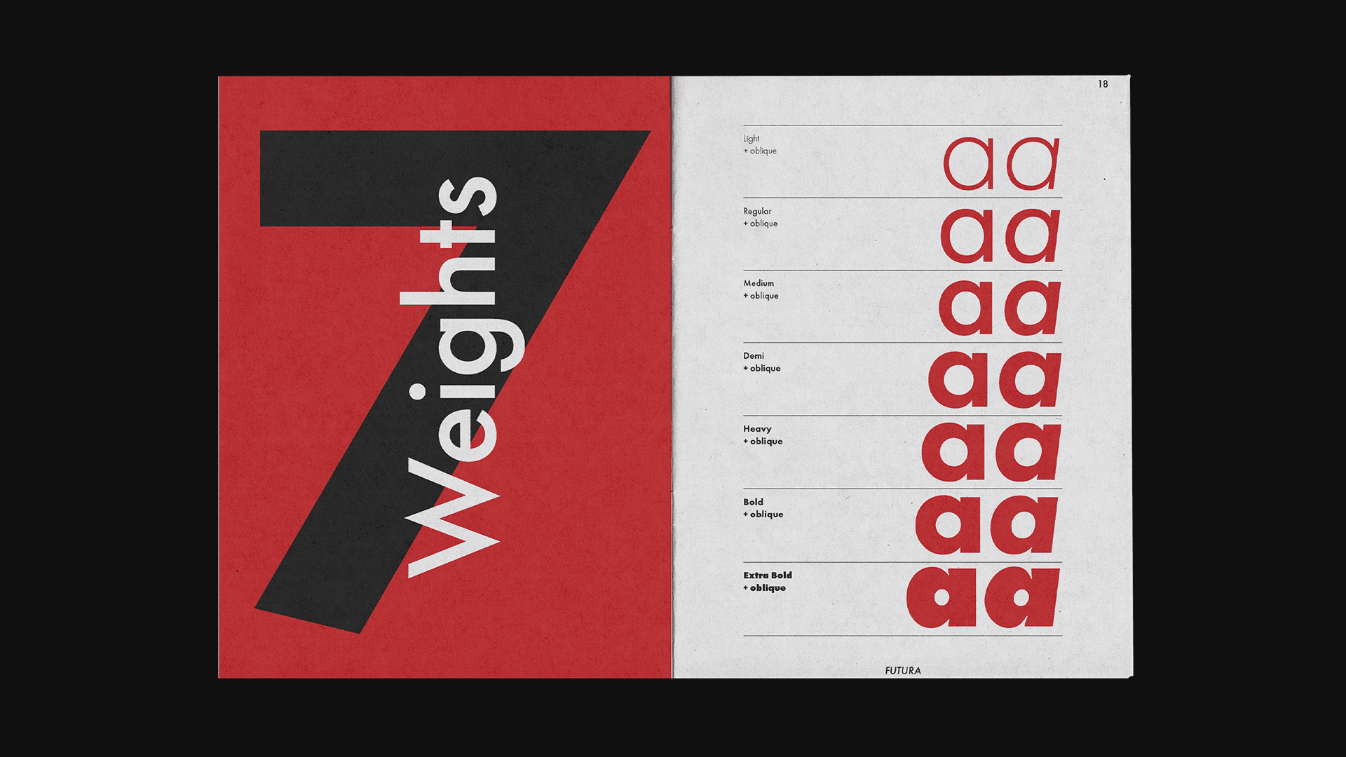
Creating a complete specimen book for Futura meant presenting its history, classification, character sets, weights, and distinctive features within a highly restricted editorial format. The design was limited to a 7 × 10-inch format, a four-column grid, black plus one colour, and typography without imagery.
The main challenge was balancing over 1,000 words of historical content with expressive typographic moments. Each spread needed to remain readable while demonstrating Futura’s geometric construction, modernist character, and versatility across headlines, body text, numerals, and display compositions.
Through iteration, I refined the grid, spacing, hierarchy, folios, and colour usage until the spreads felt connected rather than independent. Red became a controlled accent, while scale, rotation, and geometric forms created contrast and movement, resulting in a cohesive system that reflects Futura’s modernist identity.


OTHER
PROJECTS


Get in touch